Skip to content

All Alert: a crisis-support app designed to be fundable

Mobile app design for All Alert, a crisis-support app: 19 iOS screens, a brand identity and the product reasoning, in 2 months. Taken in front of 7 investors.

All Alert

The engagement

Client
A first-time founder
Industry
Digital mental health
Year
2025
Duration
2 months
Delivered
19 screens, iOS, Figma
Stack
Figma
Role
Product design, brand identity, product consultation

All Alert is a crisis-support app that puts help one tap away. Plainbuilt designed it end to end in 2 months: 19 iOS screens, the brand identity and the product reasoning, with no code by design, so its founder could raise money with a product people can tap through. It has been taken in front of 7 investors.

Who is All Alert for?

A mother lost her daughter to depression. She decided that no other parent should have to go through the same thing, and she gave the idea a name: All Alert, an app that puts help one tap away for someone in crisis. What she had was conviction. What she did not have was a product, a technical co-founder, or the capital to build one.

What was the problem?

Investors do not fund descriptions. To raise money for All Alert she needed people in a room to see it: to understand within thirty seconds who it is for, and what happens when somebody opens it on the worst night of their life. But building the app required the funding she was trying to raise. That is the loop most first-time founders get stuck in, and the expensive way out of it is to sign a development contract before a single investor has validated the idea. This engagement was scoped to break the loop from the other direction.

What did Plainbuilt do?

A two-month design and consultation engagement. No code, by design. The deliverable was a complete, investor-legible product: nineteen screens covering every flow from first launch to sending an alert, a brand identity built for the subject matter, and the product reasoning behind each decision, so she could answer "why is it like that?" in a pitch without needing us in the room.

Should every engagement end in a build?

No. This one needed to end in a fundable artifact, and scoping it that way is what made the outcome possible. Knowing where to stop is part of the job.

What happens when someone opens it on a bad night?

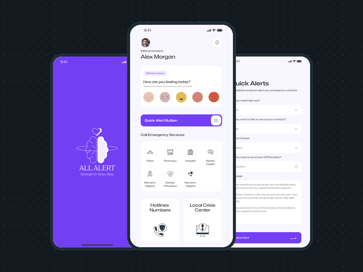
The Quick Alert screen opens with the message already written. The person picks a contact, taps the location field to attach where they are, and presses send. A person in crisis cannot compose a message asking for help, so the product does not ask them to. This is the decision the whole app rests on.
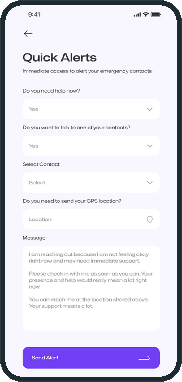
  • All Alert: What happens when someone opens it on a bad night?

How far is help from the home screen?

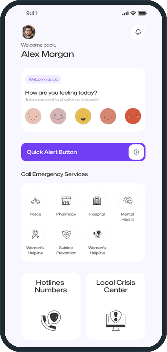
One tap. The Quick Alert button sits above everything else on the home screen, in the full brand color. No menu, no search, nothing nested: nobody browses during an emergency. Above it, the five-face mood check-in, one tap and no typing, the reason to open the app on an ordinary day; under it, the emergency services, the hotline numbers and the local crisis center.

  • All Alert: How far is help from the home screen?

When are the contacts and permissions set up?

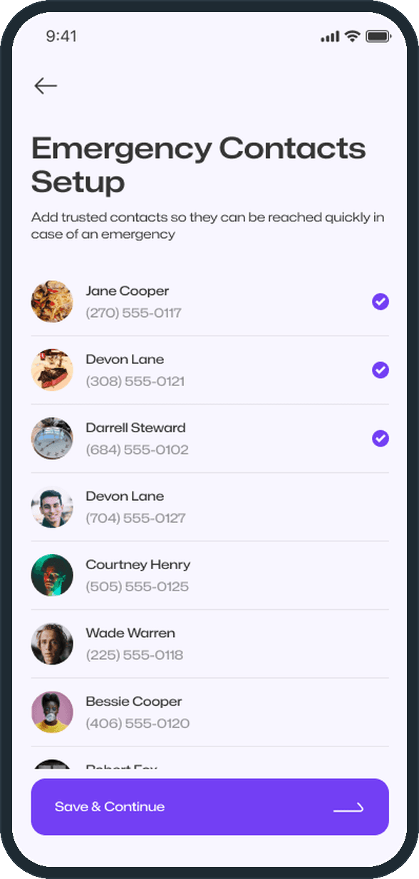
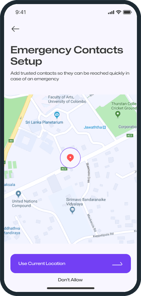
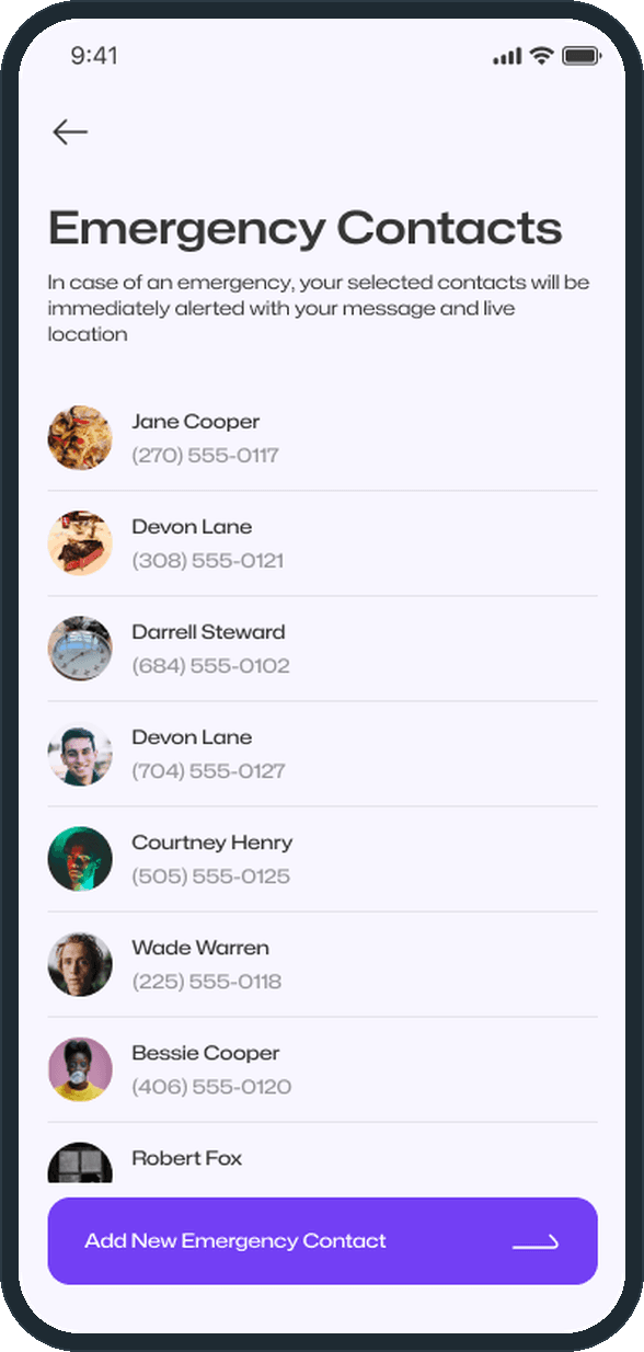
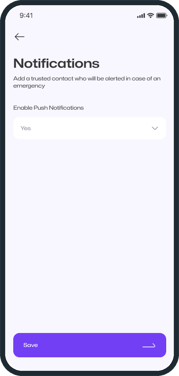
While the person is calm. Trusted contacts, location permission and notifications are all set during onboarding, long before they are needed. The product does the remembering so the user does not have to.

  • All Alert: When are the contacts and permissions set up?
  • All Alert: When are the contacts and permissions set up?

How does someone get in?

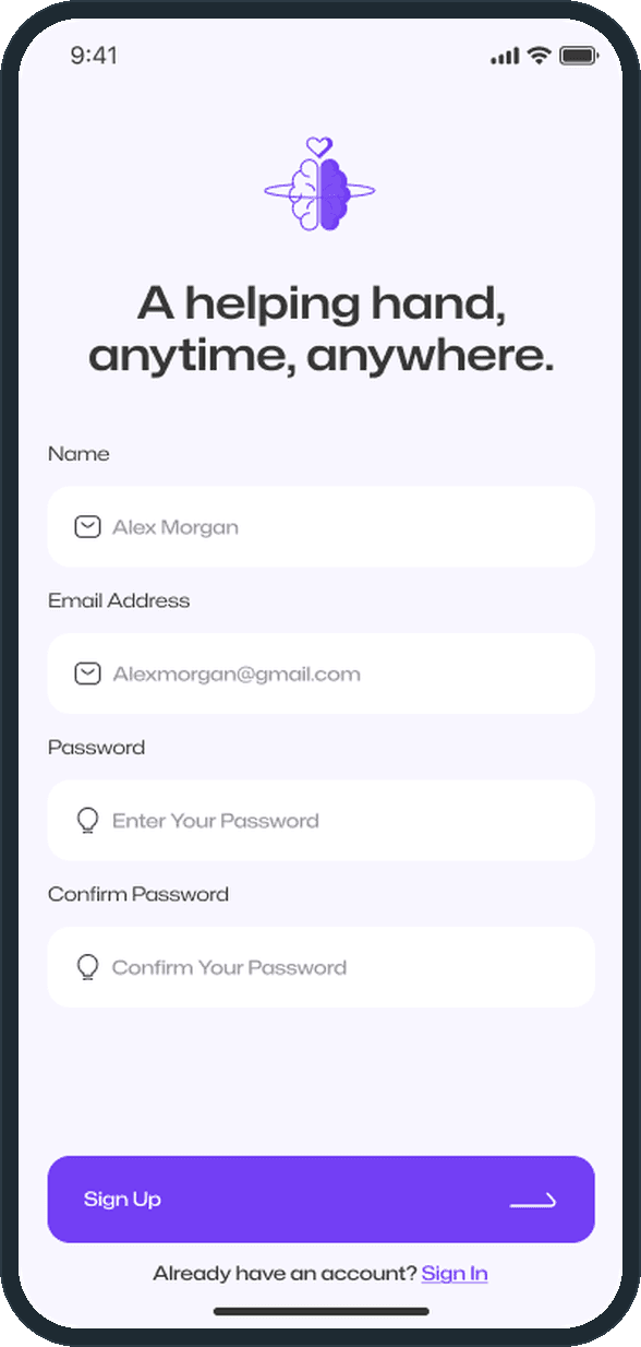
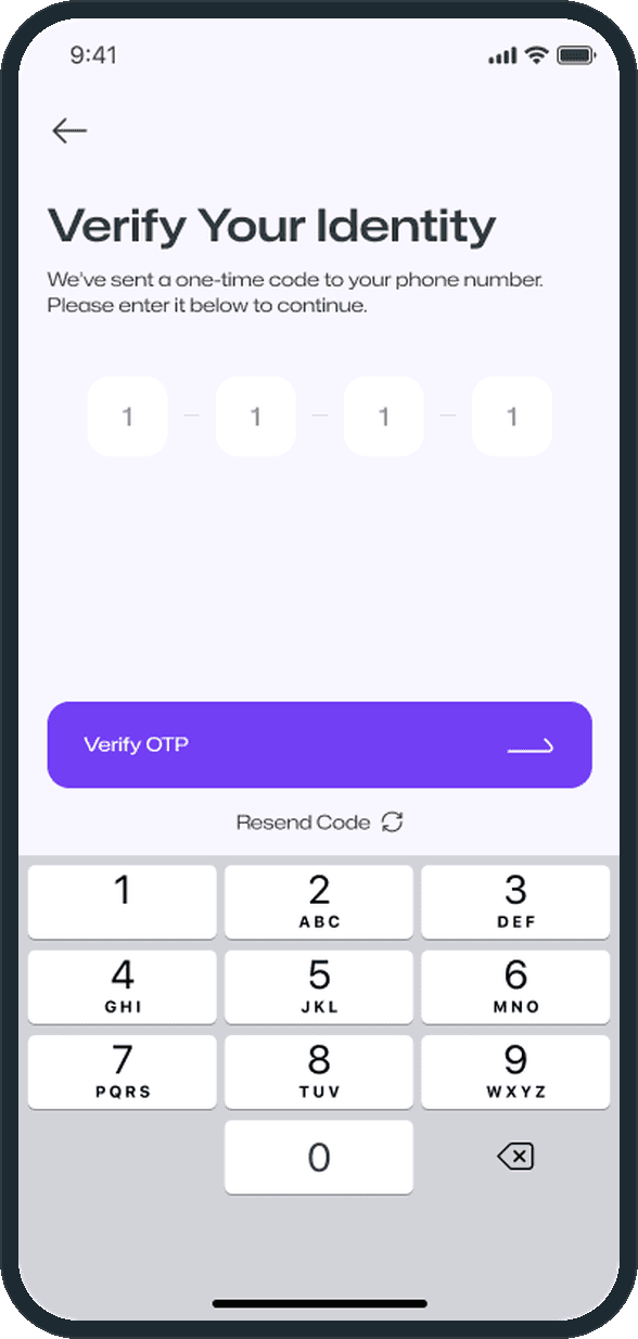
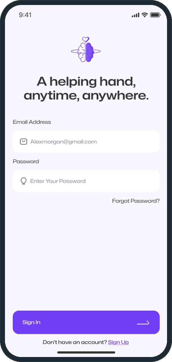
Sign up, then a one-time code to verify the phone number: two screens between installing the app and using it, because it has to be usable within a minute. Sign in is the return visit. The phone number is verified because the alert goes out by text with the live location attached.

  • All Alert: How does someone get in?
  • All Alert: How does someone get in?

What does the brand look like?

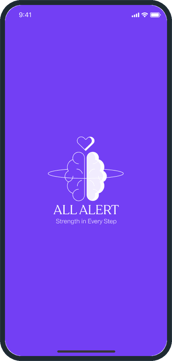
A mark of a head with a heart, the wordmark and the line Strength in Every Step, in one purple, on the splash screen. Built for the subject matter: calm, one color, nothing that reads as clinical or as an alarm.

  • All Alert: What does the brand look like?

The decisions

  • The words are already written.

    A person in crisis cannot compose a message asking for help. The Quick Alert screen opens with the message pre-written; what is left is a contact, the location and send.

  • One tap from home.

    The Quick Alert button sits above everything else on the home screen, in the full brand color, unmissable. No menu, no search, nothing nested. Nobody browses during an emergency.

  • Configured while calm, used while not.

    Trusted contacts, location permission and notifications are all set up during onboarding, long before they are needed. The product does the remembering so the user does not have to.

  • A reason to open it on an ordinary day.

    A five-face mood check-in sits at the top of the home screen. One tap, no typing. It keeps the app present in someone's life between crises, which is the only reason it will be there during one.

What was the outcome?

Taken in front of 7 investors

To follow

One outcome per item, dated, or not disclosed: never an estimate.

More screens

  • All Alert
  • All Alert
  • All Alert
  • All Alert
  • All Alert

Which of our services apply

Common questions

Did Plainbuilt build the All Alert app?

No, by design. The engagement was scoped to end in a fundable artifact: 19 designed screens, a brand identity and the reasoning behind each decision, so the founder could raise money before signing a development contract. Engineering was out of scope.

How long did the All Alert design take?

2 months, from the first working session to the 19-screen Figma prototype, the brand identity and the written product reasoning.

Can Plainbuilt design an app like this for a pitch?

Yes. The same shape of engagement: a working session, then the screens, the brand and the product reasoning in Figma, sized to what an investor needs to see in the room. Book a working session to scope one.