Skip to content

Vista: a community app for sunrise and sunset views

Vista, a sunrise and sunset community app: 41 iOS screens and a web landing page, a camera, a shared gallery, contests and a store, built in under 6 months.

Vista

The engagement

Client
Vista
Industry
Sunrise and sunset watching, lifestyle
Year
To follow
Duration
Under 6 months
Delivered
41 screens, iOS, and a web landing page: sign-in, onboarding, camera and posts, the gallery, contests, the store, profile and settings, built full stack
Stack
To follow
Role
Full-stack development: design and build of the mobile app and the landing page

Vista is a sunrise and sunset community app: people capture and post views of nearby sunspots, browse a shared photo and video gallery, vote in sponsored contests and shop a lifestyle store. Plainbuilt designed and built it full stack and delivered it in under 6 months: 41 iOS screens and a web landing page that mirrors the phone home. One line carries the design, from the splash screen: where every view has a place.

Who is Vista for?

People who go out for the sunrise or the sunset and want to share the view. Home lists Nearby Sunspots with the distance under each one, the Landscape tiles sort them into Beach, Mountain, Waterfall and Resort, and the onboarding asks what brings the person here before it asks how they want to take a view in. The contests give the same crowd a reason to post: Show Us Your Vista, with Recent Winners and a Vote Now on each current contest.

What did Plainbuilt build?

The full app, 41 screens on iOS, front to back, and the web landing page. Sign in and sign up with Facebook, Google and Apple, a 4-digit code sent by mail with Resend Again and Call Me, a location prompt, a profile picture, forgot and reset password. Two onboarding questions. Capture: an in-app camera with a photo or video toggle, a text overlay and a flip camera, then Upload Post with a description, a full-screen viewer with like, comment, share and more, and Liked By and Comments lists. Vista Gallery with search and Photos and Videos tabs. Contests: Show Us Your Vista with Recent Winners, current and upcoming contest cards marked Sponsored By with Vote Now and Enter Now, a contest detail with a status badge, the entries and a Vote button, an entries list and a 30-second sponsor video screen. The store: apparel, shoes, watches and jewelry, product details with Add To Cart and Buy Now, a cart with quantity steppers, shipping charges and a sub total, a delivery location by GPS or a typed address, a payment method with saved cards and Add new card, Pay Now, and My Orders with a Pending status. The profile with Intro, Media and My Orders tabs, and settings with change password, payment mode, push notifications, location settings, terms of use, privacy policy, help and support, delete account and logout, plus FAQ and notifications screens. The tab bar has the store, the gallery, the sun mark, the contests and the profile.

What does the sharing flow look like?

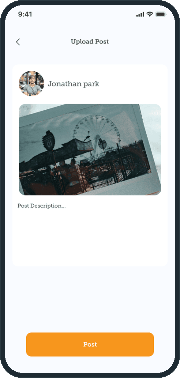
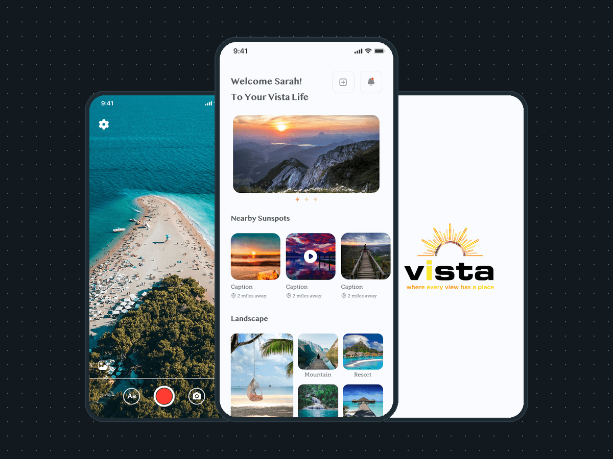
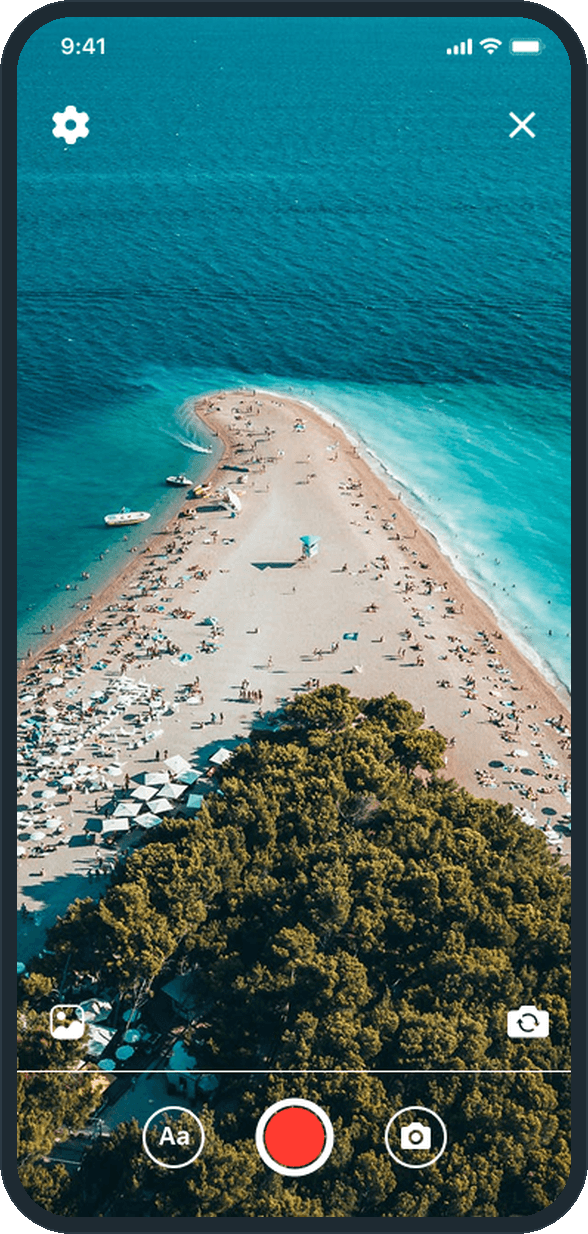
Open the camera and the view fills the screen: settings and close at the top, the gallery and the flip camera at the sides, a text overlay button, the red capture button and the photo toggle along the bottom. Upload Post shows the shot under the poster's name with a description field and one Post button. The view then plays full screen: the poster's avatar and name, the description, a music line at the bottom left, and like, comment, share and more stacked on the right. Liked By lists who liked it; Comments lists the replies with a field to type one. The post also lands in Vista Gallery under Photos or Videos and on the poster's profile under Media, where a delete sits on each tile.

Why does the landing page repeat the phone home?

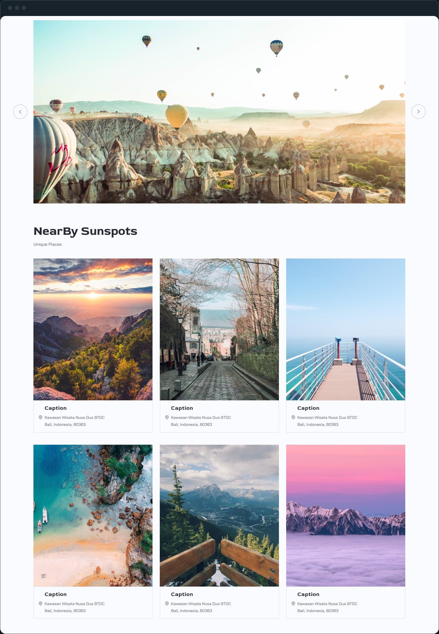
Because the page is the app's front door on the web, and a front door should look like the house. The landing page runs the same sections in the same order as the phone home: the welcome hero with the balloon carousel, NearBy Sunspots, Landscape, Latest Competitions and the Vista Lifestyle Store, with the same orange and coral accents on the same off-white. What the page adds is what a page needs: a nav across the top, a newsletter signup, Quick Link and Get in Touch columns and social icons in the footer. A person who has seen one knows the other.

How does someone share a view?

The camera opens inside the app: settings and close at the top, the photo gallery and the flip camera at the sides, a text overlay button, the red capture button and a photo toggle along the bottom. Upload Post then shows the shot under the poster's avatar and name, with a description field and one Post button. From there the view plays full screen with like, comment and share buttons, and lands in Vista Gallery.

  • Vista: How does someone share a view?
  • Vista: How does someone share a view?

Where does a view go once it is posted?

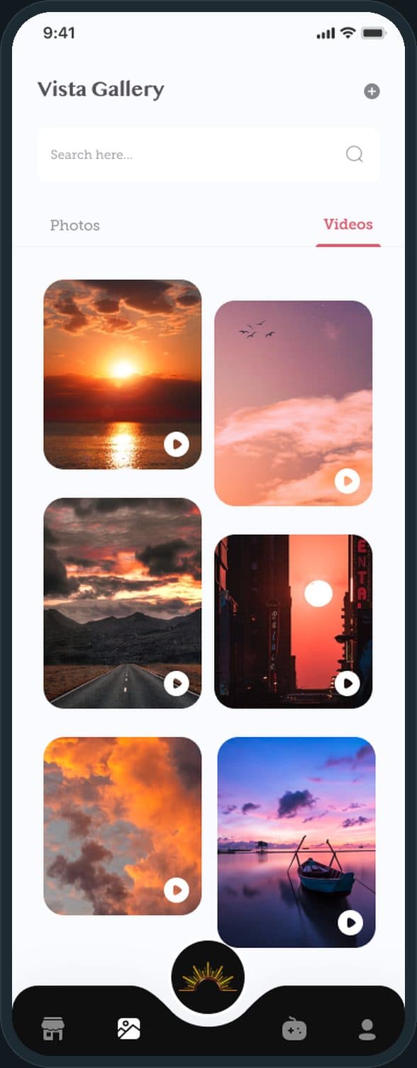
Vista Gallery holds everyone's posts behind a search bar with Photos and Videos tabs, laid out as a two-column masonry with a play badge on each video. The same media sits on the poster's own profile under a Media tab, with a delete on each tile. The gallery is one tap on the tab bar, beside the store, the contests and the profile, with the sun mark raised in the center.

Vista: Where does a view go once it is posted?

What is on the home screen?

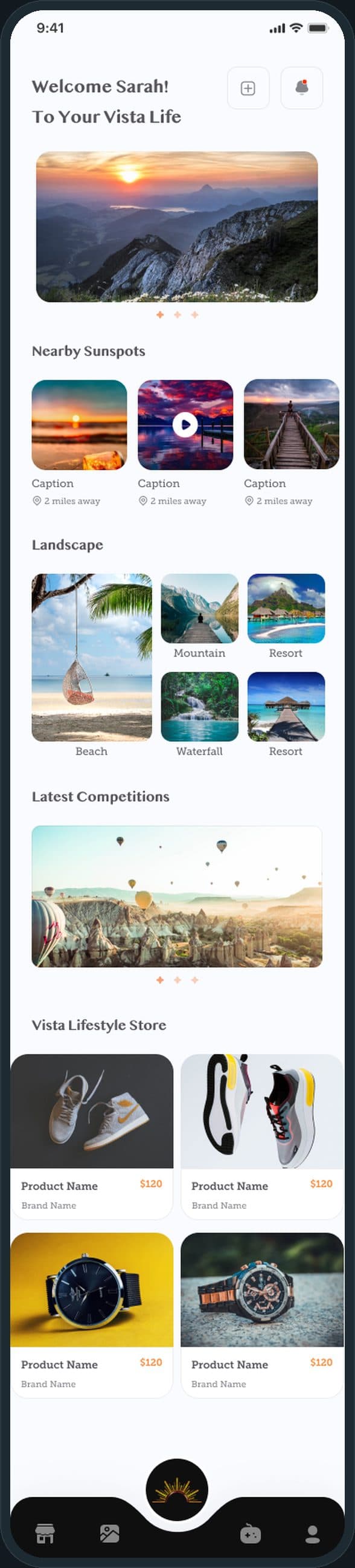
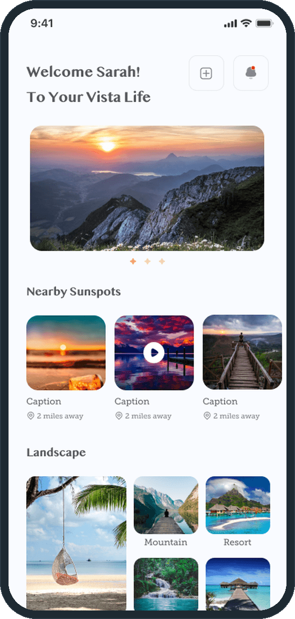
Home greets the person by first name and stacks the app in one scroll: a photo carousel, Nearby Sunspots with a caption and the distance under each tile, Landscape tiles for Beach, Mountain, Waterfall and Resort, a Latest Competitions carousel and the Vista Lifestyle Store grid. A plus and a bell sit at the top right, and the tab bar at the bottom carries the store, the gallery, the sun mark, the contests and the profile.
Vista: What is on the home screen?

How does Vista shape the experience to the person?

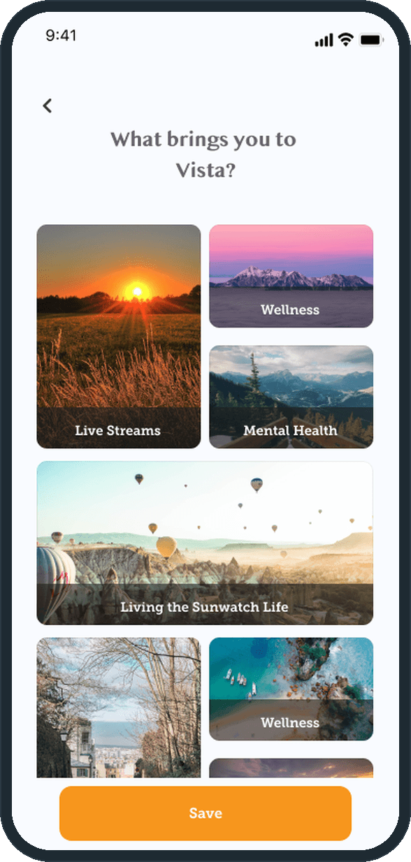
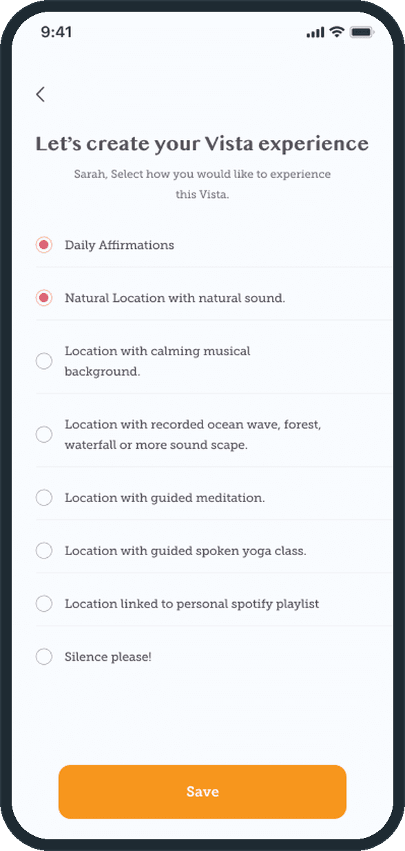
Onboarding asks two questions. What brings you to Vista? is a grid of photo tiles, Wellness, Mental Health and Living the Sunwatch Life among them, with a Save button. Let's create your Vista experience is a radio list of how to take in a view: daily affirmations, the natural sound of the location, calming music, a recorded ocean, forest or waterfall soundscape, guided meditation, a spoken yoga class, a personal playlist, or silence. The screen's own subtitle says it: select how you would like to experience this Vista.

  • Vista: How does Vista shape the experience to the person?
  • Vista: How does Vista shape the experience to the person?

What does the web landing page show?

The phone home's sections at desktop width: a carousel of hot-air balloons with an arrow at each side, then NearBy Sunspots, subtitled Unique Places, as two rows of three photo cards, each with a caption and an address line. Further down, the page runs through Landscape, Latest Competitions and the Vista Lifestyle Store to a footer with a newsletter signup, Quick Link and Get in Touch columns and social icons.

Vista: What does the web landing page show?

The decisions

  • The sun mark is the one raised button.

    The tab bar is near black with four flat tabs: the store, the gallery, the contests and the profile. The yellow sun mark sits in a black disc above the middle of the bar, on every main screen, so the brand is the button the thumb reaches first.
  • Home is the whole app in one scroll.

    Nearby Sunspots, Landscape, Latest Competitions and the Vista Lifestyle Store stack under the welcome line and the carousel. Latest Competitions and the store preview two of the tabs, and Nearby Sunspots and Landscape sort the views by place, so a person sees what is near, what is on and what is for sale without leaving Home.

  • The camera is the app's own.

    Capture starts inside Vista: a camera view with settings, a gallery button, a flip camera, a text overlay, a photo or video toggle and the red capture button, then Upload Post with a description. A view goes from the sky to the gallery in two screens.

  • The web page mirrors the phone.

    The landing page repeats the phone home section for section: the welcome hero and carousel, NearBy Sunspots, Landscape, Latest Competitions and the store, with the same orange and coral accents on the same off-white page. One layout to learn, on either screen.

What was the outcome?

Built and delivered in under 6 months

One outcome per item, dated, or not disclosed: never an estimate.

More screens

  • Vista
  • Vista

Common questions

Did Plainbuilt build Vista?

Yes. Plainbuilt designed and built it full stack and delivered it in under 6 months.

What do the 41 Vista screens cover?

Splash and sign in or sign up with Facebook, Google and Apple, a 4-digit code by mail, the location prompt, a profile picture, forgot and reset password; the two onboarding questions; the camera, Upload Post, the full-screen viewer, Liked By and Comments; Vista Gallery with Photos and Videos tabs; the contests with Recent Winners, the current and upcoming contest cards, a contest detail, the entries list and a sponsor video screen; the store with categories, product details, the cart, the delivery address, payment and My Orders; the profile with Intro, Media and My Orders tabs; and settings with change password, payment mode, push notifications, location settings, terms of use, privacy policy, help and support, delete account, logout, FAQ and notifications.

Did Plainbuilt build the web landing page too?

Yes. Plainbuilt designed and built the landing page as well, and it repeats the phone home section for section: the welcome hero and carousel, NearBy Sunspots, Landscape, Latest Competitions and the Vista Lifestyle Store.